It was never finished before, but it’s closer now.
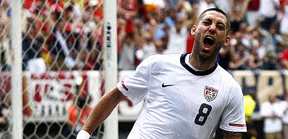
You can see above on the chest of Clint Dempsey, the awful crest the United States Soccer Federation currently uses. It’s silly, amateurish and a joke. Similar to the play of the US in the last World Cups. I kid, I kid, we’re vastly improving and many years down the road will most likely win one. As in, twenty years or more, it’ll take some serious time.
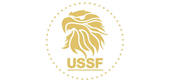
Anyway, late last year I designed one of my favorite things I had done in build up to finding a design job. I had wanted to do it for years and it was to re-imagine the USSF crest/logo. So, I did and you can see it below.

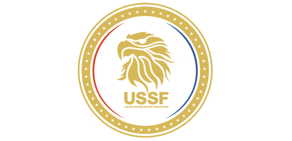
However, I never felt it was quite finished. Maybe it was, though. I originally didn’t even put the stars around it. But I just felt it was almost too flat or that needed more elements and I challenged myself by trying to incorporate red and blue. Even though just the gold would look great on a white or blue shirt, I figured I’d give it a shot, so what I came up with yesterday is below.

Am I happy with it? I think so.
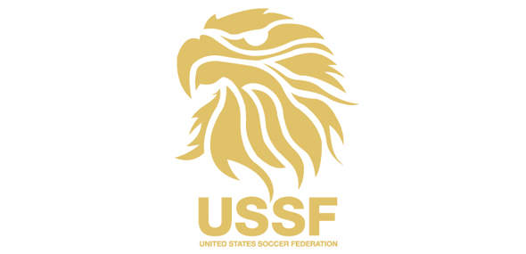
Part of me feels that just the eagle and type is still best, but I do not know. Might as well post that as well so I can then look back and realize it was better before I added anything else. Or was it?

+
Artist Lymbyc Systym
Album Shutter Release
Forgive me, but, that is the best damn logo for a USA jersey I have ever seen!!! NIKE PICK IT UP!!! THROW MONEY AT THIS GUY!!! I WANT THIS AS MY JERSEY!!!
Your instincts were right, the bottom one looks the best. How about just “USSF” or “US SOCCER” below the eagle?
Have you done any others? It would be cool to see your take on a “snake” logo, or a logo in the shape of a shield (like those of most MLS teams).
Doug, my gut is usually right, so I should’ve stayed with it.
I originally was playing with the Nike snake one, but eventually turned to the eagle. As for a shield, since the current US Soccer logo is in the classic shield shape, I wanted to move away from that and instead of one large symbol.
As for the type underneath, if anything were to go it would be the spelled out name while the initials would remain. Thanks for the comments, sir. I appreciate it.
this is brilliant. first one is good but any one of these looks sick. little dutch knvb inspired eagle but I like the flared look way more. Stars around the icon are awesome. This needs to be sent to Nike or USSF right now. Well done man. If you know ppl do it.