Why would I not post about football/soccer? Especially when it’s about design and the sport.
Many people who know me know that I have a passion for soccer, or as I prefer to call it, football. Those who do know may not know just how much I love it, and that each weekend I wake up earlier than I do for work on weekdays in order to watch the club I strongly support and love, Arsenal.
While watching the sport a few years ago, I realized how much better the broadcast design was in Germany, especially compared to the United States or England. Instead of being futuristic or shiny, the on-screen graphics were very legible and had clearly been thought out. Since that point, I’ve wanted to experiment in that realm of design. Most on-screen graphics on sport or news broadcasts are often very poorly designed.
Starting next year, NBC and its affiliates have the broadcast rights to the world’s most popular league, the English Premier League, which happens to be the league that Arsenal play in. When I thought about this today, I realized it was the perfect chance for me to finally play around with this area of design.
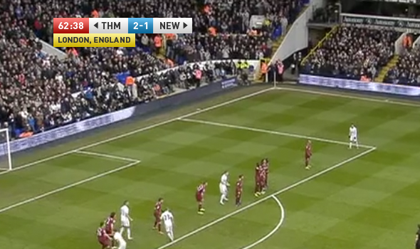
Below is just the start of the many things I will hopefully show. Starting with the scoreboard is vital, as its almost always displayed.

First, the image quality itself is rather low, as I simply pulled it from a video of highlights I was watching this weekend. Second, the colors are deliberate. Go ahead and take a look at the NBC logo, and you’ll see that three colors were pulled from it. Don’t worry, the other three might also make an appearance. Second, how does one tell what team is what if they’re new to the sport? That is what the arrows next to the abbreviated names are for. They show what goal each team is playing towards, and will of course switch after halftime when the sides switch sides. No need for colored names, backgrounds, or logos.
Also, the location of the match would not always be displayed, but would appear throughout the match at certain intervals.
For now, that is all I want to show, but several other stat overlays are being worked on. I’d prefer higher quality screenshots that appear they were taken from the game and not from a camera being held by a photographer on the edge of the field, but I’ll see what I can come up with.
Can’t get enough footie? Stay tuned for some more redesigned MLS logos.
Comments
No comments yet.