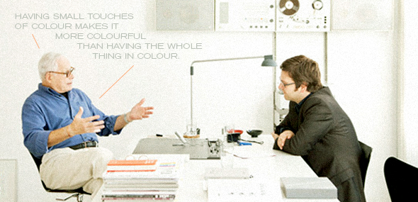
Color does not mean colorful. Brilliant.
As with most quotes, the brilliance in this one can be found directly in it’s truth. Saying something that has been washed over with numerous colors is colorful is the same as saying something that has been covered in mud is dirty. It’s a far too obvious and painfully literal thought.
To me, color has been and always should be used as an accent or an accessory. That doesn’t mean no color is used, but instead how many colors and how they’re used together. Confused yet?
In design, color should not be a crutch or a cover for something lacking in depth or function. It should be used to entice previously uninterested eyes or even add depth. It’s a small finishing tool that should be utilized to wrap something up or give it the extra piece it needs. It shouldn’t be the focal point, or the first thing someone notices. If I ever do anything and the first thing someone thinks is that it’s “colorful” then I haven’t done my job. Can it be colorful, yes, but that is a branch off the tree itself, the tree being design.
Is it any surprise that more and more now you will see designer show a collection of logos that are in black or white or black and a slightly muted color? No, it’s not.
Color is an element, design is the compound.
Comments
No comments yet.