In thirty minutes, Erik Spiekermann shows how easy it is to clearly communicate. Even when it’s to the entire world.
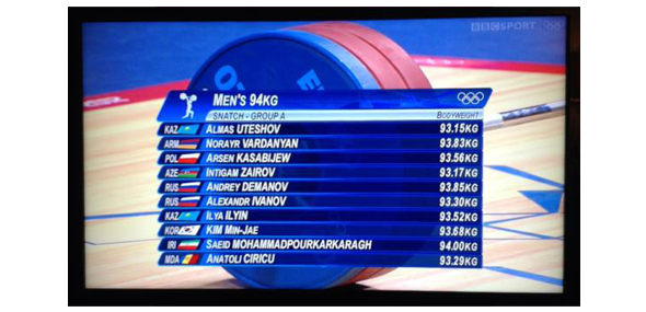
I’ve never been a huge fan of Twitter, but I’m slowly starting to tweet more often. Before I did much tweeting at all, I would often read. Someone who I always was keeping up with was Erik Spiekermann. Nobody I follow provides more laughs or information regarding design. So, when he was not pleased with the television graphics for the 2012 Olympics, he took to Twitter. The following picture was posted, and as you can see it’s not easy to read. Does it look nice at a glance? Well, at a glance it certainly doesn’t look awful. However, once you try and read the information and take from it what you want, you run into issues.

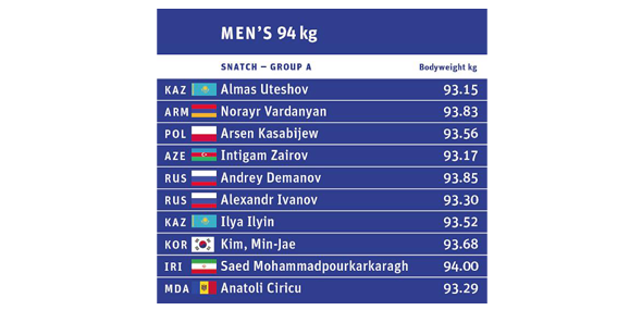
First, the all caps are a nightmare to read. Second, the small caps do not help. Third, the gradients and bevels only add to the frustration. Fourth, why the italics? Nobody really knows. So, instead of just leaving it at that, Erik instead went into InDesign for thirty minutes and came up with an infinitely better solution. It’s really rather simple. One typeface, no distracting colors or effects and designed with the goal of communication and legibility.

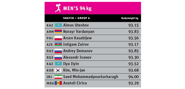
Not being one to settle, Erik then made it even better by applying the magenta that has been used throughout the games.

Design is certainly not easy, but it’s also not as hard as some people make it seem. Erik fixed something in thirty minutes that someone else most likely spent hours messing up. By having the proper goal going into it, he accomplished what the graphics ultimately are needed for, and that is to communicate to the viewer. In their current state, the graphics serve as candy on the screen.
Something pretty to look at while you attempt to see who is competing, statistics, etc. Erik flipped it the other way around. He put information on the screen, while still making it aesthetically pleasing enough to not bore you. If he was making a real attempt at redesigning the graphics as a whole, he’d come up with something much better, but that wasn’t the point. The point was that in thirty minutes he understood the problem and fixed it.
What is the point of all of this? It’s going to be much deeper discussed in a post in the near future, but for now the point is that “good design” these days is often seen simply as “pretty”. Notice how design was left off the last time? Far too often things that look good, new, or interesting are labeled as being a great execution of design, when in reality they’re nothing more than a piece of art. As I said before, that is the large topic for a post in the near future. For now, let’s just appreciate the thirty minute master, Erik Spiekermann.
Comments
No comments yet.