Fold it like a map.
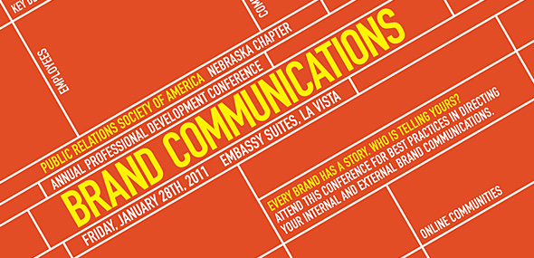
Several weeks ago, Drew Davies from the incredible Oxide Design Co. asked if I’d be interested in taking on a freelance project. It would be to create pieces for the Public Relations Society of America Nebraska Chapter’s annual Professional Development Conference. I said absolutely, and the above image is the result of a 4×6 postcard to act as a ‘save the date’ for the event.
The idea behind the event is the conference will focus on how to ‘Direct Your Brand’. Without given a clear set of exact instructions, my mind was able to wander and I ended up on a road map. I’ve always found them quite elegant in their own way. Perhaps it’s the straight lines and an overhead 2D shot of something. Just maybe.
I figured a map is the perfect thing to to not only convey communications but also directing something. Plus, the keywords for the event acted perfectly as street names next to the lines representing the grid of the map. Give it a little tilt to rid it of anything boring and you have the finished product. Currently, a brochure is also being designed for the event. Pictures of that once it’s finished and printed.
Comments
No comments yet.