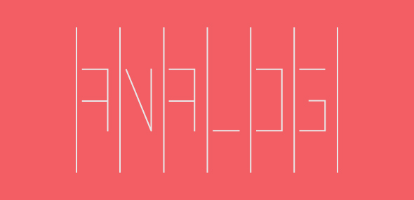
To this day, it’s my favorite logo that I’ve designed.
The story of Analog goes back to when I was driving to see a movie. The movie was Crazy Heart and I do believe it was a Tuesday. As I exited the interstate and neared the theater, an idea came into my head. I could design a logo for a music publication and name it Analog. I immediately started thinking of an idea of how to execute this, with first thoughts of it just being the letter A.
Throughout the entire movie, which was alright and only worth it for the performance of Jeff Bridges, I just thought about the logo. I couldn’t wait to get home so I could start designing. True nerd right there.
So, when I arrived home I crafted what I thought was the perfect solution. You can see it below and after visiting Oxide Design the next day and their intern at the, Adam Casey, I decided it needed some work.

So, in the next few days I continued to try other things. What I then ended up with was something more rigid, which is what my plan was. I wasn’t too happy with it, but I knew I was exploring and that is what counted.

Then, I went yet another direction and when I look at it now, boy is it silly. Nothing more to say.

Then, I landed on what you see at the very top and I fell in love with it as soon as I drew it on paper. Between each line represents the space in a groove on a vinyl record, where all the information is stored. Inside of those grooves on the logo, is where the letters are formed. The letters are the information and all form to make the name and the word, much like forming to make a song.
The letters are also not fully constructed, as to point the the imperfection of the analog sound and the way that the information is fragmented. Also, it creates the same feel of a needle moving up and down and not remaining on one smooth path.
It had deep meaning, was clever (I thought) and looked interesting. I loved it then and I still love it. It’s a manifestation of my love of typography, which I also will not shy away from. Can a logo just be type? Of course. Especially when the type is something else other than just a letter.
+
Artist John Vanderslice
Album Emerald City
Comments
No comments yet.