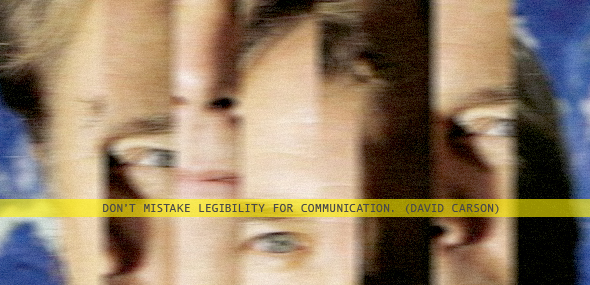
You, sir, are a damn fool.
I recall when I first came across David Carson. I liked him. I thought he was brash and cool and made good points about boring typefaces. What was I thinking?
Carson is known for his “grunge” work, or as in our office it’s known as “the g word” as we try not to say it. He’ll chop up type, distort images and even lay out entire articles in Dingbats, because when he read it he found it boring. So he “interpreted” it, thus making it impossible for anyone else to make their own interpretation. He did the worst thing possible. He made the reader completely useless. If Carson only wants to get out his message, he should paint a picture, not lay out articles.
Carson’s quote is as ridiculous as his methods of design, because he’s talking about typography. Type is the visual representation of words we speak. If someone writes an article, it needs to be read. If someone has a thought, it doesn’t have to be. Something as exact and direct as an article or a poster which contains information and more than just an idea must be legible for people to take in the information and then use it. Imagine if Carson designed a newspaper. We wouldn’t get the news unless he found it to be interesting.
While his contribution to the design field could be noted as a good thing, his arrogant words of self appreciation are not. Carson also said there is a very fine line between simple, clean and good and simple, clean and boring. That, I agree with. However, you don’t need visual vomit not to be boring. Something simple can be engaging and can inform. Something chaotic could be engaging, but can it inform as well?
There is some of Carson’s work that I do find visually intriguing, but it stops at the point when I must analyze instead of simply intake it. I shouldn’t have to work to find the message. You should give it to me.
Communication is a very broad word, but in the design field when something is written down and expressed through words, legibility is the first thing that matters.
Comments
No comments yet.