First edition of the Fake Criterion Collection on Design School Dropout and it’s a rather odd film.
Zidane, un portrait du 21e siècle (Zidane: A 21st Century Portrait) is a film that completely revolves around former football icon, Zinedine Zidane. That is football as in the one you play with your feet.
Recognized mostly in popular culture in the states as the player who delivered the greatest headbutt in the history of the universe, in Europe and those who follow the sport of football, he’s known as one of the greatest, if not the greatest footballer of all-time.
The film was made using seventeen synchronized cameras at a game between Real Madrid and Villarreal in the Spanish Primera Division in 2006. Each camera, which were placed in a different area of the stadium, followed the game itself but mostly focused on Zidane. View a fantastic clip featuring the song ‘7:25’ by Mogwai to get a taste of it. For a football nerd like myself, it was gorgeous to watch. Also, Mogwai did the soundtrack, so that is a major plus.
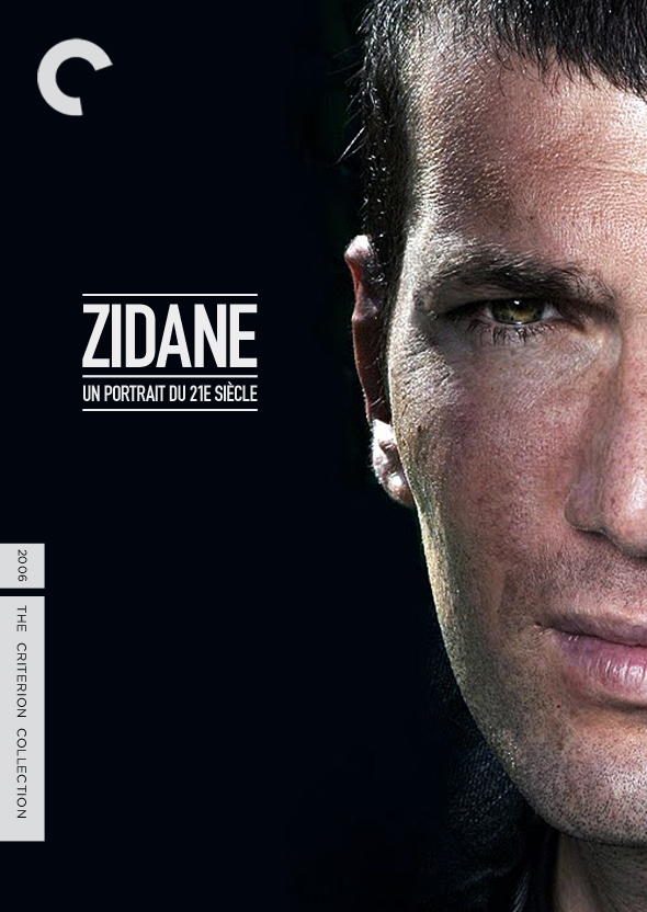
As for the actual cover, it’s rather simple. I decided to use a current picture of Zidane, instead of him while playing for Madrid. I did so, because to me, the film was not just about that game in that uniform and in those moments. It was about more than that and about Zidane and who he is. So, why not use an image of him now? As for the type, DIN and the three lines have meaning. They’re a reference to the classic three lines of Adidas, which has been the uniform manufacturer for Real Madrid for some time. So, those three lines are synonymous with Real Madrid and in a way, Zidane. Also, the white on black was very intentional as Madrid are known as ‘Los Blancos’ or ‘The Whites’. The classic Madrid uniform is black and white, so I wanted to tie that in as well.

+
Artist This Will Destroy You
Album Young Mountain EP
I watched the video… and think you may have meant to say that this film revolves around former “soccer” icon.
The restraint in your design continues to impress.
Restraint impressing? Interesting. You should elaborate if you could.
This statement was meant fully as a compliment.
I think of restraint in design not as a limitation of what you could or should have done, but a knowledge of when and where to stop.
I was 98% sure that is what you meant, so thank you very much, sir.
I like to think while I use few physical layers, the mental ones are stacked rather high. Our at least I pretend that it’s true.